THE URC’S NEWPORT-BASED Dragons have announced a rebrand as Dragons RFC.
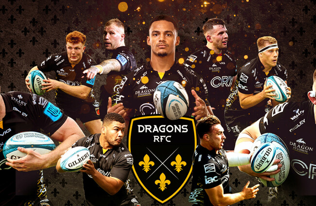
A new club logo comprises three fleurs-de-lis – symbolic across many crests in the Dragons’ region – with colours of black and amber to represent Newport, plus the blue of Monmouthshire and Gwent.
“Our new name makes it clear – we are a rugby club,” the Dragons said in a statement.
“This is a message we know strikes home with our supporters. We all see ourselves as a club, and we feel strongly about that.
🐉 𝘿𝙍𝘼𝙂𝙊𝙉𝙎 𝙍𝙁𝘾 | Dragons Rugby today officially becomes Dragons RFC as we start a new era here at Rodney Parade.
— Dragons RFC (@dragonsrugby) June 27, 2022
▶️ https://t.co/TRAM6IwZCi#BringYourFire🔥 #WeAreGwentRugby pic.twitter.com/GEPxM3IeMi
“This does not detract from us representing our region or the people of Gwent. But we are being authentically true to what we have always been, and now our name reflects this.”
David Buttress, chairman of the United Rugby Championship outfit, added: “We are excited to welcome in a new era at our great club, and this change comes in the wake of a robust, challenging and honest debate over the past 12 months.
“Opinions and feedback have been canvassed to ensure the club has a brand that feels authentic and true to us.
“This is a new direction for our club. We are not losing our identity, we are evolving and growing.”
“We are proud to be based in Newport at Rodney Parade and the black and amber colour represents that. Our proud connection to Gwent and the player pathway is reflected in the design.
“We know how proud our fans are to support Dragons RFC and we look forward to now coming together as one unified club under this new identity and working together towards a bright and successful future.”
